In this outcome I talk about the media products I created, the tools I utilized for them, and how I get familiar with the current design landscape and trends.

My Portfolio Website

Goal

To create a portfolio website that is easy enough to use and represents me and my style.

Method

    To achieve that I need to make it:

  • East to navigate through.
  • Easy to read through.
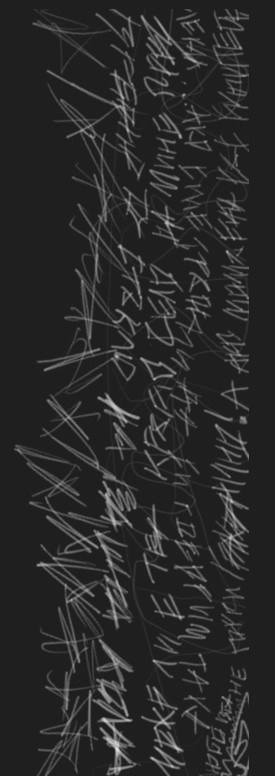
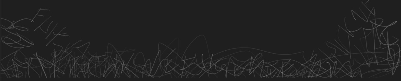
  • Have handwritten styling and animations of it.

I need to test it with users to see how they will interact with it and take notes and improve on feedback that I’ve received from teachers.

What I Did

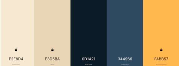
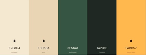
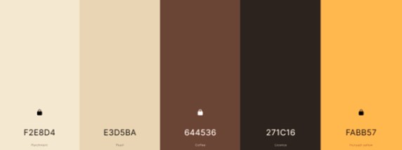
I first created the color palette that I wanted to go with.

I then created the background sketch for the landing page.

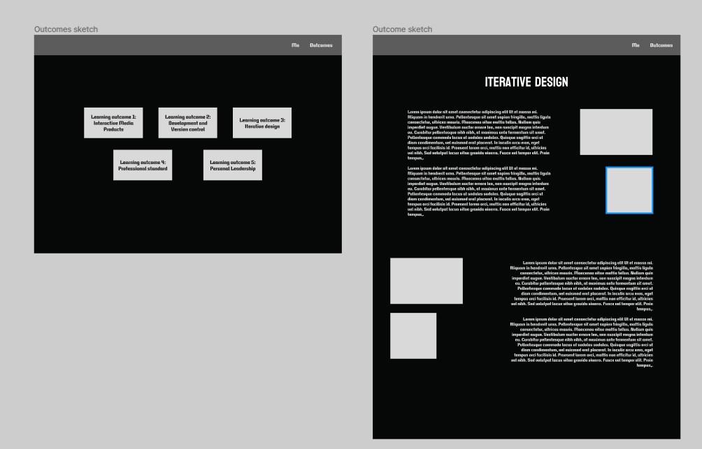
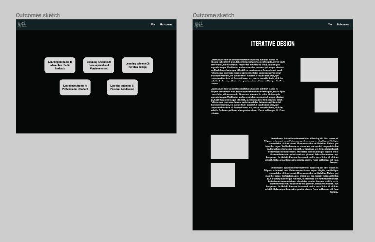
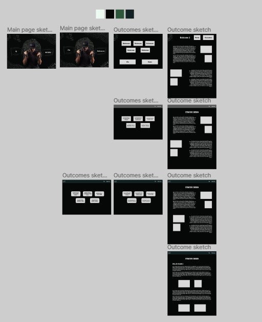
I made prototypes, for the other pages, that orient me in how I want to structure my website, and how it will look.

I continued styling and creating “art” for it.

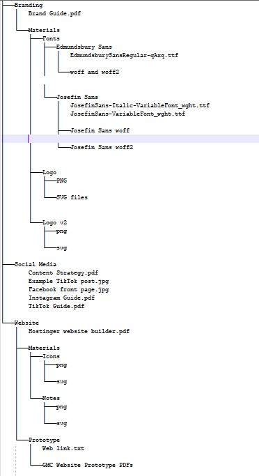
I documented my work and wrote content for it.

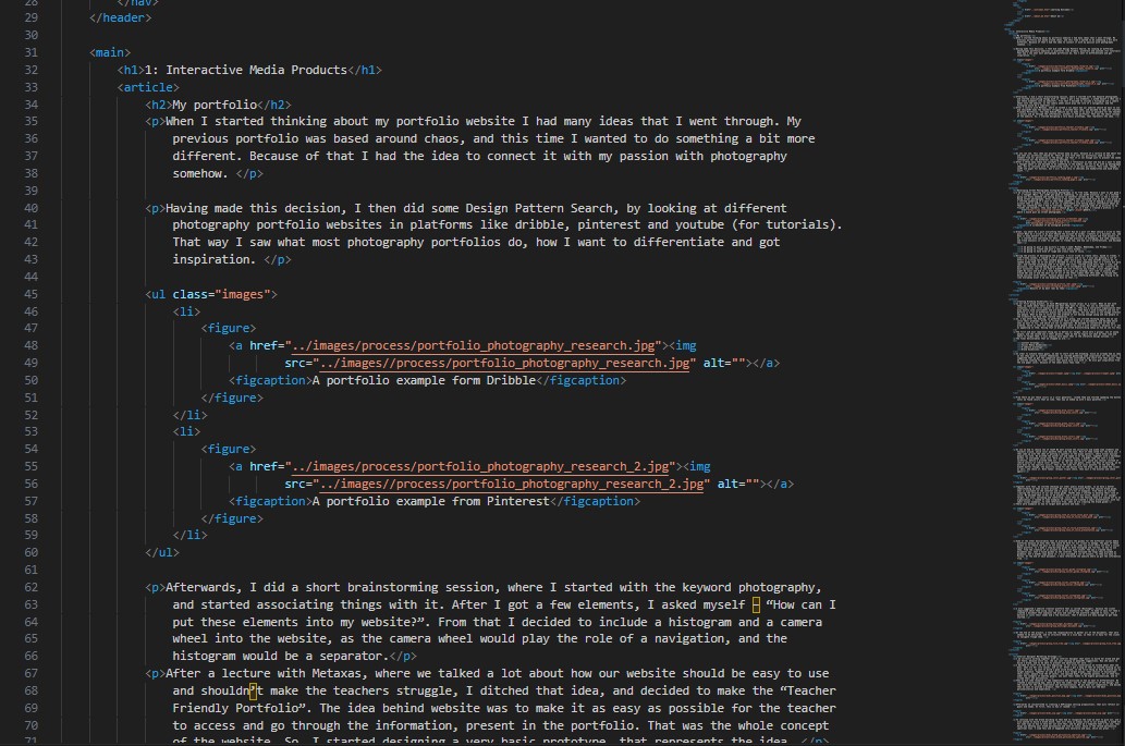
Then I developed it.

I also took use of PNG animations (APNG), due to a suggestion from Metaxas. I implemented them to some of the hand-drawn elements on the website.

Having to make the design responsive and properly working on a phone was the hardest challenge, since there were a lot of changes that had to be made. These included:

  • Making a hamburger menu (no JS btw)
  • Adjusting paddings and margins
  • Playing with decoration images sizes
  • Removing/adding elements
  • Playing with animations
  • Fixing bugs

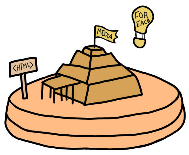
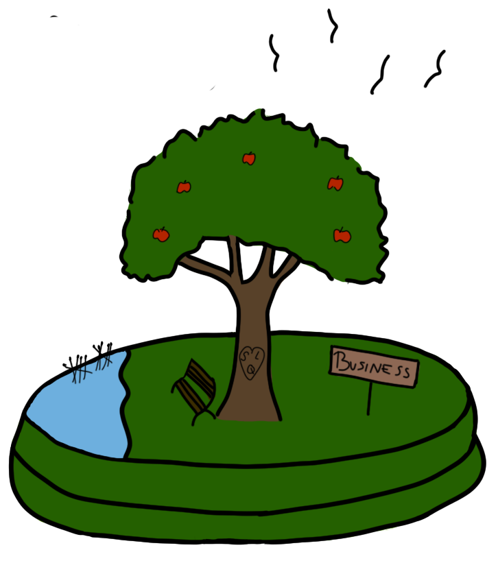
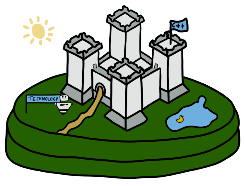
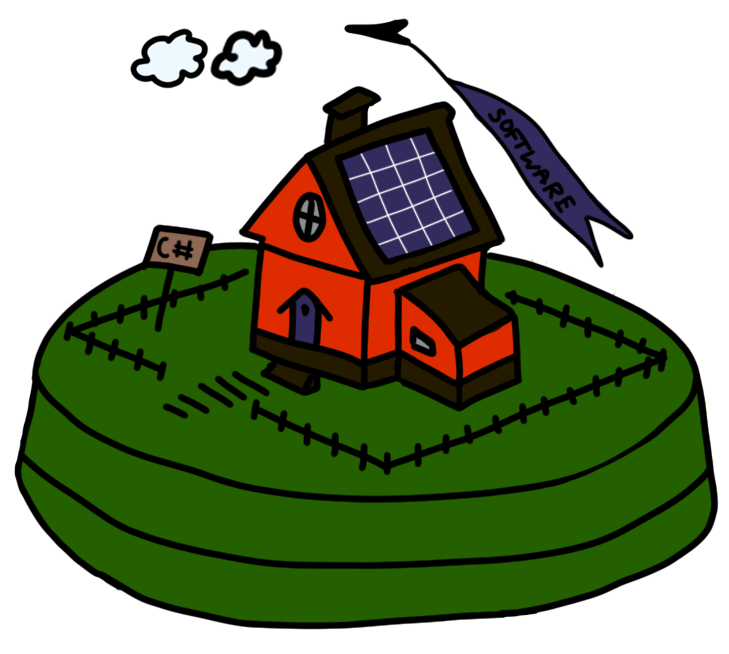
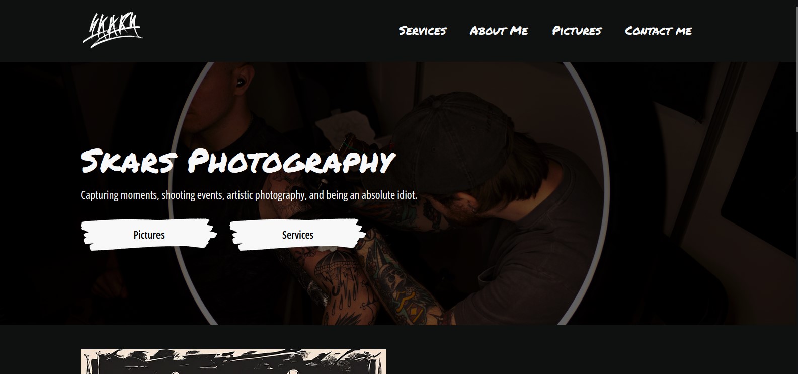
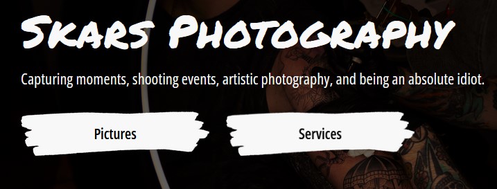
Here’s how it turned out:

Recording from my phone

Used Tools

Krita - for creating the drawings
VSCode - mainly for writing the HTML
Firefox dev tools - for writing the CSS and testing
Figma - for prototyping
Word and Obsidialn - for documenting
Gitlab - for version control

Branding Guidlines

Introduction

In our first group project we had to develop branding guidlines for a local orchestra in Eindhoven in order to help them rebrand and to reach a younger audience.

Goal

Create easy to use guidelines to help our customer.

Method

  • Understand customers challenges and goals.
  • Try get in their shoes.
  • Create guidelines, that are step by step, and a 4 yo can follow them.

What I Did

I initiated the branding process by suggesting the utilization of the copperish yellow from the instruments as a foundational element. Collaboratively, we created three color palettes, conducting a voting process to finalize the color scheme.

Drawing inspiration from public brand guides like Spotify's, I developed the brand guide’s, tone of voice, plus some examples of them. (See here)

Additionally, I created detailed social media guides for Instagram and TikTok (the links lead to the documents I created, not the platforms), providing step-by-step instructions and visuals for ease of understanding. Recognizing the client's need for a cost-effective website creation platform, I recommended Hostinger and provided tutorials and comparisons with Wix.

As the project concluded, I took responsibility for organizing and structuring all project documents for easy client access and navigation. Below you can see the structure of the files listed in a tree.

Used Tools

Adobe color, coolors.co - for generating the colors
Photoshop, Canva - for creating the example posts
PowerPoint - for creating the tone of voice example
Word - for creating the guidelines for the platforms

Interactive Profile Awareness Game

Introduction

In our second group project we had to make a marketing campaign, that is to improve the lack of awarenes for the Fontys ICT Profiles. For that our team decided to create a website, plus an interactive game that would be played on the open day, which I worked on and talk about here.

Goal

Create a game, which students can play on the Open Day, that gives more clarity what each profile consists of, and increase the profile awareness of upcoming students.

Method

Make 3 challenges for each profile, that are related to it. Then the students will receive a scoreboard, and collect points, until they get a certain amount. After collecting that amount, there will be a price.

What I did

I came up with the idea of having a game, that is related to the profiles, and then me and Symon together composed 6 proof of concept challenges, for 2 profiles, each with easy, medium and hard difficulties. They are the following:

    Media Design:
  • Easy: Sketch a logo of your Initials
  • Medium: Pass this Color Game with 5.0 or above
  • Hard: Prototype a business card for a car dealership owner, that has requirements for it. The player must meet every single one of them.
    Software:
  • Easy: Complete 10 levels of RunMarco (a begginers software development game)
  • Medium: Complete 3 levels of RunMarco console version
  • Hard: Make a flowchart to solve a basic mathematical equation.

To develop and user test 3 of them, we had to design them appropriately. While Symon was writing two of the tasks, I designed the scoreboard, which will be printed out on a A5 piece of paper, and the judges will put stamps(stickers) on, for each collected point.

Note that it is a two-sided print.

Used Tools

Figma – (please note that I did the posters, on my weaker laptop, that cannot run tools like Illustrator, so I had to deal with what it can handle. That’s the reason the designs were made in Figma) for the scoreboard
Google Docs – for writing down our ideas and then refining them with Symon
Fontys Brand Guide – to stick with the Fontys brand, while making the scoreboard.

Interior Designer Marketing Strategy

Goal

Develop a marketing strategy for an interior designer aiming to establish her brand and expand her clientele beyond word-of-mouth referrals.

Method

  • Understand her needs
  • Constatnly communicate with her
  • Make it as easy as possible for her

What I did

We first had a talk, so I can understand better what her services are, her core values, and her aspirations. Then we agreed to first focus on building a strong brand foundation.

To do that I created a small document with the most important things we had to know, and some helpers for defining a brand strategy.

The first step involved defining the target audience, which we identified as businessmen, their spouses, individuals from the IT sector, and affluent young adults with discerning tastes. These segments seek highly personalized home designs that reflect their personalities.

Right after, we conducted competitor research and devised a positioning map emphasizing complexity of design and superior user experience as key differentiators.

We then concentrated on crafting a unique selling proposition (USP) aligned with our objectives. Simultaneously, we determined the desired brand vibe and established a brand house to ensure consistency in branding efforts.

Utilizing a "brand personality spectrum" tool suggested by Stan, we developed the brand personality and tone of voice seamlessly, enhancing the brand's identity and communication strategy.

Later on, I worked together with the guy, responsible for her website, and I made the copywrite for the webpages, both on Bulgarian and English. You can see more about that in Iterative design here.

Used Tools

PowerPoint - to create the brand guide document
Notepad ++ - to write down the copies

Exercise Games

In this section I've included interactive web pages, that I've done with the goal of exercising my programming skills. They are not a finished product by any means, but do showcase creating interactive media products.

JS Snake Game

While practicing JS in class, we created a snake game, similar to the one on the old Nokia phones. I later took the initiative to redevelop the game from scratch, because I wanted to assure myself I understand how it works. You can click on the video, to play it yourself!.

Quote Generator

To improve my JS skills, I started creating simple interactive web pages. One of the first was this Quote Generator. Click on the video to play it.


Interactive Profile Games

Introduction

In our third project of the semester, we had to create a website for Fontys, with a purpose of converting visitors into leads. Me and my group decided to make a webpage that explains every profile, and then a separate game for each one, that consists of an activity, related to that profile.

Goal

Create enjoyable games, that are suitable for our target audience.

Method

Brainstorm for game ideas and ask the following profiles if they believe the game is related. Then test them with people who do not have any experience and see if they are playable and enjoyable.

What I Did

I created 5 games – 4 of which follow a ctf(capture the flag) like structure, inspired from platforms like tryhackme.com, where you first explain a concept to the user, and then present him a game/task to solve, connected to that concept.

I also created a layout ordering game for the media profile. There you can select colors, each representing a different element for the webpage (ads, text, images) and then paint the empty layout the way you want.

Click on an island to play a game:

  • Media Game
  • Business Game
  • Infra Game
  • Tech Game
  • Software Game

Used Tools

JavaScript
HTML
CSS
MDN

My Photography Webpage

Introduction

As I mention in other sections, I’m working on becoming a freelance photographer. For now the only place to display my images was my Instagram, which is not professional at all, and also I can’t put the information I want present there.

Because of that I decided to make my Project X be my photography portfolio website.

Goal

Create a well branded website, which can generate leads, and present my business in front of people.

Method

Design the website in Figma > test > iterate > develop > test again > iterate again.

For this project I’ve also utilized several CMD methods, but mostly:

  • Competitive Analysis (library)
  • Literature Study (library)
  • Survey (field)
  • Usability Testing (lab)
  • USP (showroom)
  • Prototyping (workshop)
  • Customer Journey (stepping stones)

What I did

To learn more about the process, check out the “Iterative Design” learning outcome section. To try out the product, click on the picture below, or here.

Basically, my website consists of:

  • Landing page.
  • Services page, containing a “Contact me” section.
  • Images page, with the different categories.
  • A gallery page for each category.
  • About Me page.

Here’s how the website works:

The decision of putting these specific two CTA buttons at the top, was made by research, that I did, which showcased the level of importance of different elements from the eyes of the user. These two were the most important.

I also included a slider with reviews (actual not made up ones) and a USP section, to increase the perceived likelihood of achievement.

The website is also fully responsive.

Please note there are still placeholder images, which are to be replaced with ones I’ve still not created.

Used Tools

Figma – for prototyping. See here.
Github: See here.
Photoshop – for creating design elements.
Google forms – for making surveys and conducting research.
JavaScript
HTML
CSS
MDN